
In this article we will learn how to create & use material dashboard in angular. Please read my previous article JavaScript Form Validation. If you are new to angular then please explore the Angular Tutorials where we discussed step by step process of angular from beginner to advance level.
- We create a sample angular 9 application and there use in-built angular dashboard functionality.
- Here we can see how to add angular material dashboard dynamically with card. We can do change the dashboard card columns and rows dynamically.
Add Material Design in Angular
To create the angular application use the below command. ng-material-dashboard is the project name.
ng new ng-material-dashboard
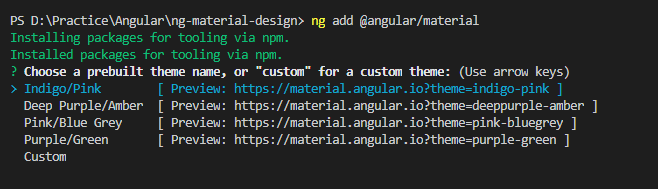
To add the material design in angular just follow the below command. Also you can find the details about our previous article How to use angular material in angular.
ng add @angular/material
After type the command in terminal window and hit enter then a prompt will ask to choose which material template want to install into the application like this. Let’s install first one “Indigo/Pink” you can choose any other theme just navigate to the link.
Generating a Material Dashboard
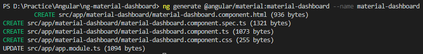
To generate a material dashboard use the below command. This command should create a starter dashboard component.
Synatax
ng generate @angular/material:material-dashboard --name = <Name of Dashboard>
material-dashboard is a starter component, which generates a group of the materialized components in the form of the dashboard by just providing a name. To create the dashboard run the below command
ng generate @angular/material:material-dashboard --name material-dashboard
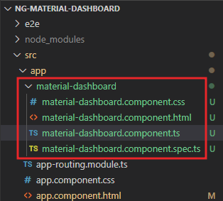
And as you can see in the console, there are a few files created inside the app directory with a component name provided. The file structure looks like the below screen.
After installing this you can see the material-dashboard ts, html and css file automatically created.
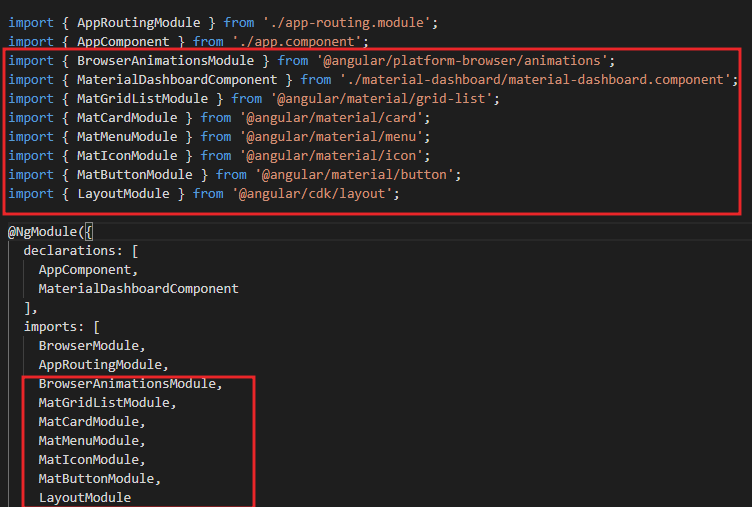
app.module.ts
You can see here when the material-dashboard component is created it automatically add the required module inside app.module.ts
material-dashboard.component.ts
In the below typescript we create a Cards list that return how many columns and rows. You can change the column and row to set dynamically.
import { Component } from '@angular/core';
import { map } from 'rxjs/operators';
import { Breakpoints, BreakpointObserver } from '@angular/cdk/layout';
@Component({
  selector: 'app-material-dashboard',
  templateUrl: './material-dashboard.component.html',
  styleUrls: ['./material-dashboard.component.css']
})
export class MaterialDashboardComponent {
  /** Based on the screen size, switch from standard to one column per row */
  cards = this.breakpointObserver.observe(Breakpoints.Handset).pipe(
    map(({ matches }) => {
      if (matches) {
        return [
          { title: 'Card 1', cols: 1, rows: 1 },
          { title: 'Card 2', cols: 1, rows: 1 },
          { title: 'Card 3', cols: 1, rows: 1 },
          { title: 'Card 4', cols: 1, rows: 1 }
        ];
      }
      return [
        { title: 'Card 1', cols: 2, rows: 1 },
        { title: 'Card 2', cols: 1, rows: 1 },
        { title: 'Card 3', cols: 1, rows: 2 },
        { title: 'Card 4', cols: 1, rows: 1 }
      ];
    })
  );
  constructor(private breakpointObserver: BreakpointObserver) {}
}
material-dashboard.component.html
The below snippet is a basic building block which was generated by the component generator. Dynamically bind the cards from material-dashboard.component.ts and using *ngFor iterate the result through material components.
<div class="grid-container">
  <h1 class="mat-h1">Dashboard</h1>
  <mat-grid-list cols="2" rowHeight="350px">
    <mat-grid-tile *ngFor="let card of cards | async" [colspan]="card.cols" [rowspan]="card.rows">
      <mat-card class="dashboard-card">
        <mat-card-header>
          <mat-card-title>
            {{card.title}}
            <button mat-icon-button class="more-button" [matMenuTriggerFor]="menu" aria-label="Toggle menu">
              <mat-icon>more_vert</mat-icon>
            </button>
            <mat-menu #menu="matMenu" xPosition="before">
              <button mat-menu-item>Expand</button>
              <button mat-menu-item>Remove</button>
            </mat-menu>
          </mat-card-title>
        </mat-card-header>
        <mat-card-content class="dashboard-card-content">
          <div>Card Content Here</div>
        </mat-card-content>
      </mat-card>
    </mat-grid-tile>
  </mat-grid-list>
</div>
material-dashboard.component.css
This style sheet file contains different classes to provide different positioning and directions throughout the page.
.grid-container {
  margin: 20px;
}
.dashboard-card {
  position: absolute;
  top: 15px;
  left: 15px;
  right: 15px;
  bottom: 15px;
}
.more-button {
  position: absolute;
  top: 5px;
  right: 10px;
}
.dashboard-card-content {
  text-align: center;
}Now, the last step is to execute our dashboard app. For that, just go to the app.component.html file and remove all of the content and just add the material-dashboard tag like below;
<app-material-dashboard> </app-material-dashboard>
All the changes has been made, let’s run the application and see the output like below;
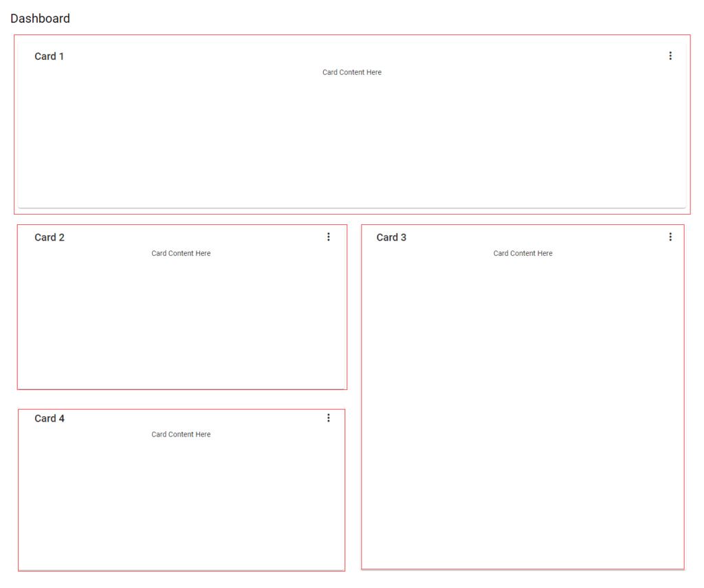
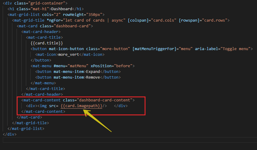
You can do place the dynamic content/image into the card accordingly in material-dashboard.component.ts. Let’s say we add a image field in card like below;
return [
        { title: 'Card 1', cols: 2, rows: 1, imagepath: '/assets/img1.png' },
        { title: 'Card 2', cols: 1, rows: 1, imagepath: '/assets/img2.png' },
        { title: 'Card 3', cols: 1, rows: 2, imagepath: '/assets/img3.png' },
        { title: 'Card 4', cols: 1, rows: 1 , imagepath: '/assets/img4.png' }
      ];
And in the material-dashboard.component.html add like this.
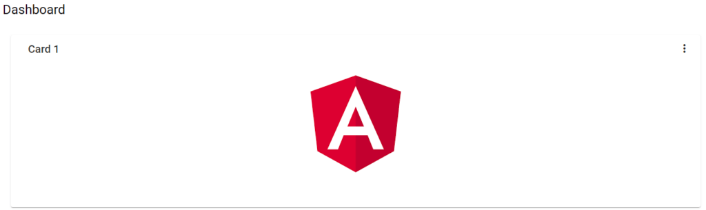
After run the application you can see the image are displayed on the card. According to your dashboard design you can do the stuff.
Conclusion
Leave behind your valuable queries and suggestions in the comment section below. Also, if you think this article helps you, do not forget to share this with your developer community. Happy Coding 🙂
Jayant Tripathy
Coder, Blogger, YouTuberA passionate developer keep focus on learning and working on new technology.