This article will teach us How to Create a responsive sidebar with Angular Material- Angular 18 Example Series. Sidebar navigation menus are the most frequent layout type web apps used today. However, most of the components we have are not very responsive. In this tutorial, I’ll show you how to create a completely responsive sidebar navigation menu in Angular using the Angular Material module. Please read my previous article on How to Deploy Angular 17/18 App in GitHub Pages.
Angular Material allows you to add wonderful, already working features to your applications, but not all of them are suitable for your needs. In this tutorial, I’ll show you how to make a side menu with a small variation by extending Angular Material’s side.
Please check the Live demo here. https://jayanttripathy.github.io/ng-sidebar-material-basic/home
</> Please find the source code on this link.
Setting up the Angular Project
Here I have created an angular 18 project. Using the below command CLI in our terminal, Angular material template we have selected the theme as violet.
ng new ng-sidebar-material
ng add @angular/material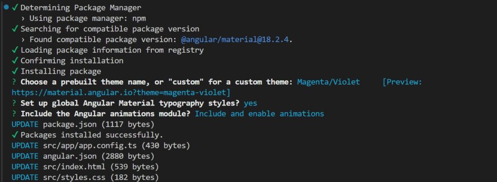
Adding toolbar and sidebar components
Let’s include the material toolbar and material side navigation bar in our main app.component.html page.
<mat-toolbar> Responsive side navigation </mat-toolbar>
<mat-sidenav-container>
  <mat-sidenav> </mat-sidenav>
  <mat-sidenav-content>
    <div class="content mat-elevation-z8">Main content goes here</div>
  </mat-sidenav-content>
</mat-sidenav-container>- As you can see, the material side navigation component consists of several elements. The container is known as the
mat-sidenav-container. This includes both themat-sidenav,mat-sidenav-contentcomponents. mat-sidenavis the sidebar menu, andmat-sidenav-contentis your app’s primary content. You could retain any stuff here, even a router outlet.
Import the Required modules
Import the required modules on the app.component.ts modules, here are the standalone: true.
@Component({
  selector: 'app-root',
  standalone: true,
  imports: [RouterOutlet, MatToolbarModule, MatSidenavModule, MatIconModule, MatDivider],
  templateUrl: './app.component.html',
  styleUrl: './app.component.css'
})
Styling the layout CSS
- Here’s what our app.component.css file looks like right now.
mat-toolbar {
    background: #b227bd;
    color: white;
  }

  mat-sidenav {
    margin: 16px;
    width: 200px;
    border-right: none;
    background: #b227bd;
    color: white;
    border-radius: 10px;
    padding: 16px;
    text-align: center;
  }

  .content {
    height: calc(100vh - 98px);
    border-radius: 10px;
    margin: 16px;
    margin-left: 32px;

    display: flex;
    justify-content: center;
    align-items: center;

    font-size: 2rem;
    color: lightgray;
  }

  mat-sidenav-container {
    height: calc(100vh - 65px);
  }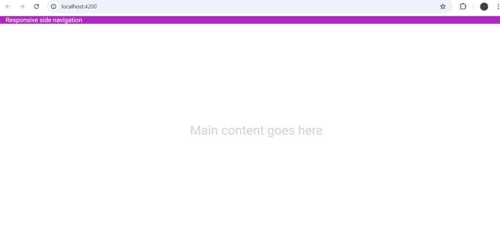
We’ve incorporated various adjustments, such as a rounded border and elevation, using the mat-elevation-z8 class from the material and opened mode="side".
<mat-toolbar> Responsive side navigation </mat-toolbar>
<mat-sidenav-container>
  <mat-sidenav class="mat-elevation-z8" opened mode="side"></mat-sidenav>
  <mat-sidenav-content>
    <div class="content mat-elevation-z10">Main content goes here</div>
  </mat-sidenav-content>
</mat-sidenav-container>
Now the basic Layout looks like below.

Style our sidebar and add menu items
- Let’s now add some menu items, or buttons, to the sidebar.
 <!-- <mat-nav-list> -->
    <mat-list-item>
      <a class="menu-icons">
        <mat-icon>house</mat-icon>
        <span>Home</span>
      </a>
    </mat-list-item>
    <mat-list-item>
      <a class="menu-icons">
        <mat-icon>person</mat-icon>
        <span>Profile</span>
      </a>
    </mat-list-item>
    <mat-list-item>
      <a class="menu-icons">
        <mat-icon>info</mat-icon>
        <span>Information</span>
      </a>
    </mat-list-item>

    <mat-divider></mat-divider>

    <mat-list-item>
      <a class="menu-icons">
        <mat-icon>help</mat-icon>
        <span>Help</span>
      </a>
    </mat-list-item>

    <div class="bottom-nav">
      <mat-divider></mat-divider>

      <mat-list-item>
        <a class="menu-icons">
          <mat-icon>settings</mat-icon>
          <span>Settings</span>
        </a>
      </mat-list-item>
    </div>
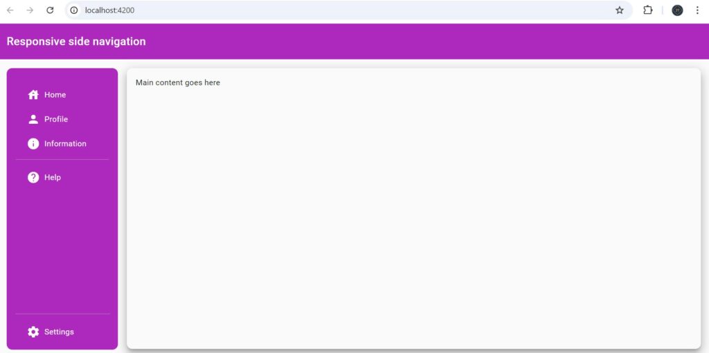
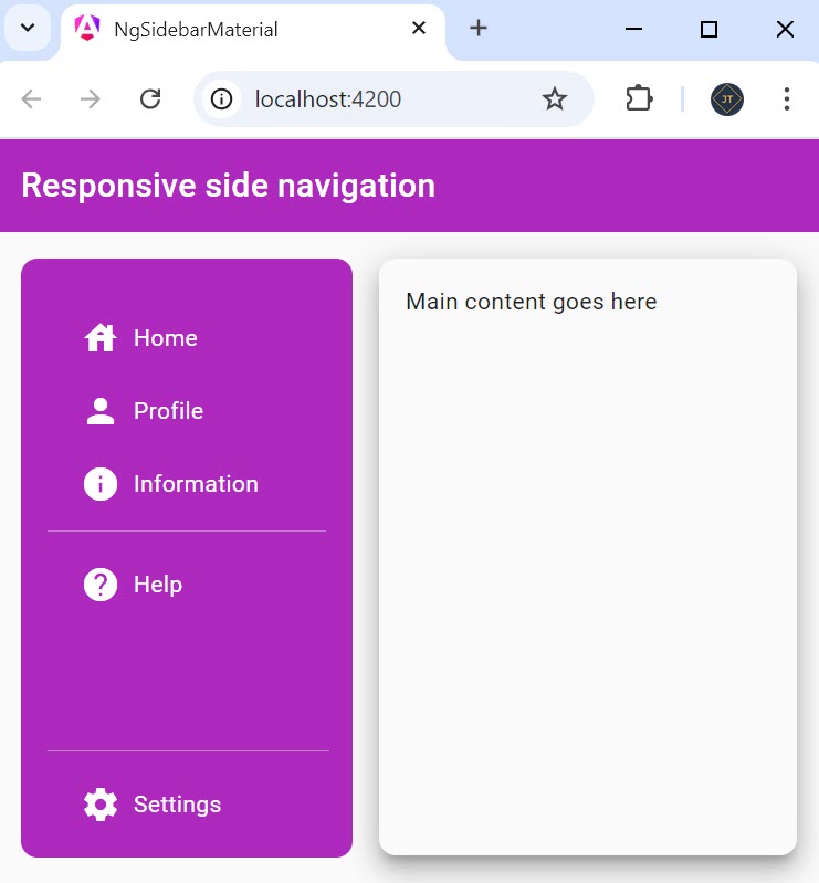
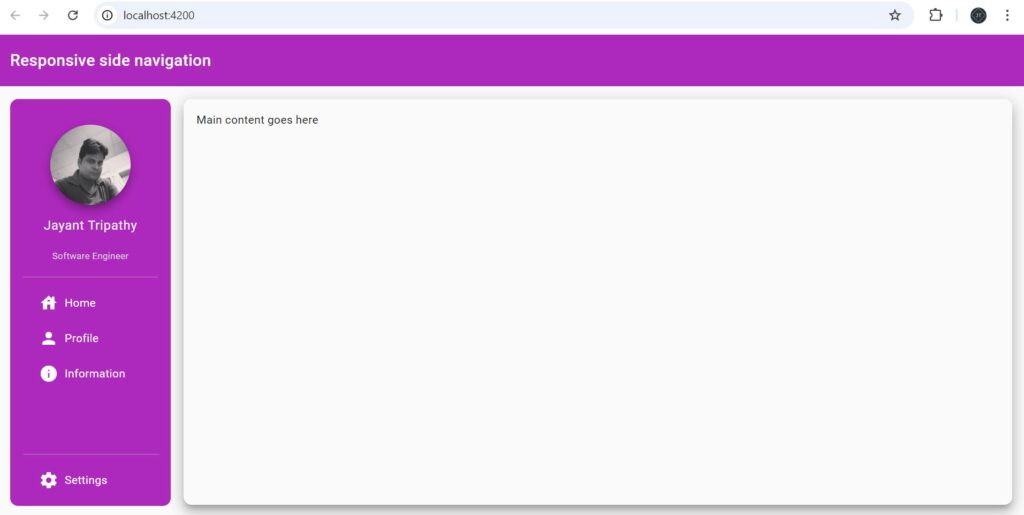
<!-- </mat-nav-list> -->- The navigation outputs are shown below; they are fully responsive, and we can see that they work properly on both desktop and mobile devices.

Add the user’s profile picture
Let us also create a section at the top of the sidebar with a user’s profile.
 <img class="avatar mat-elevation-z8"
      src="https://pbs.twimg.com/profile_images/697111882826559488/113lXfh-_400x400.jpg" />

    <h4 class="name">Jayant Tripathy</h4>
<p class="designation">Software Engineer</p>- Add the below CSS to the styling
.avatar {
    margin-top: 16px;
    width: 100px;
    height: 100px;
    border-radius: 50%;
  }

  .name {
    margin-top: 8px;
    font-weight: normal;
  }

  .designation {
    margin-top: 2px;
    font-size: 0.7rem;
    color: lightgrey;
  }
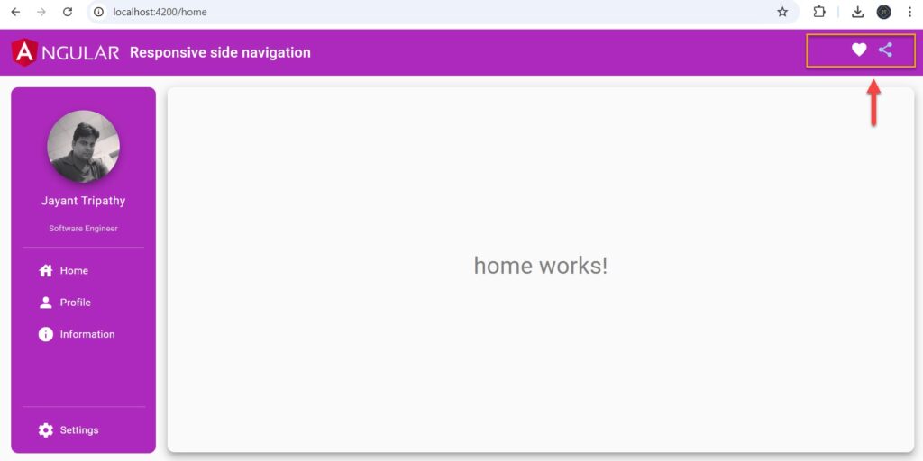
- Add the right-hand side Toolbar Icon
Add the Pages and Route for Navigation
Add the below pages for the Navigation
ng g c pages/home
ng g c pages/profile
ng g c pages/info
ng g c pages/settings
import { Routes } from '@angular/router';
import { SettingsComponent } from './pages/settings/settings.component';
import { InfoComponent } from './pages/info/info.component';
import { ProfileComponent } from './pages/profile/profile.component';
import { HomeComponent } from './pages/home/home.component';
import { PagenotfoundComponent } from './pages/pagenotfound/pagenotfound.component';
export const routes: Routes = [
{
path: '',
pathMatch: 'full',
redirectTo: 'home',
},
{
path: 'home',
component: HomeComponent,
},
{
path: 'profile',
component: ProfileComponent,
},
{
path: 'info',
component: InfoComponent,
},
{
path: 'settings',
component: SettingsComponent,
},
{
path: '**',
component: PagenotfoundComponent,
}
];
Making the sidebar responsive
To make the sidebar responsive, the material side nav component has a property named mode. For huge screen sizes, the mode should be side. This implies that the sidenav will always be visible, alongside our main content.
The other mode has ended. We’ll need this if we want the sidebar to be hidden by default but to appear over the content when we browse to another section.
So all we need is a means to toggle between these modes when the screen size changes. Fortunately, we can detect changes in screen size using the Angular CDK layout package and its BreakpointObserver service. Let us see some code!
export class AppComponent {
  @ViewChild(MatSidenav)
  sidenav!: MatSidenav;
  title = 'ng-sidebar-material';
  constructor(private observer: BreakpointObserver, private router: Router) {}
  ngAfterViewInit() {
    this.observer.observe(["(max-width: 800px)"]).subscribe((res) => {
      if (res.matches) {
        this.sidenav.mode = "over";
        this.sidenav.close();
      } else {
        this.sidenav.mode = "side";
        this.sidenav.open();
      }
    });
}- Line #2 – To acquire the MatSidenav component reference in our code, add the
ViewChilddecorator at the very top. Next, we include the BreakpointObserver service in our constructor. - Line #5 – We’re utilizing the BreakpointObserver’s observe method, which accepts any number of breakpoints. If any of them matches or changes state (i.e., no longer matches), all method subscriptions are alerted.
- Line #7 – In our situation, we set our breakpoint to 800px. This means that if it matches, we must switch to over mode for our sidebar and close it. And vice versa if they do not match.
Adding the sidebar menu toggle button for small screens
While the sidebar navigation menu hides on smaller screens, there is no way to bring it up when we require it. We need a menu toggle button to open and close the menu on smaller screens.
<mat-toolbar class="mat-elevation-z8">
 <button mat-icon-button *ngIf="sidenav.mode === 'over'"
  (click)="sidenav.toggle()" class="nav-button">
  <mat-icon *ngIf="!sidenav.opened"> menu </mat-icon>
  <mat-icon *ngIf="sidenav.opened"> close </mat-icon>
</button>
  <img class="nav-img" src="https://v17.angular.io/assets/images/logos/angular/logo-nav@2x.png">
  Responsive side navigation
  <div class="display-right">
    <button mat-icon-button class="example-icon favorite-icon" aria-label="Example icon-button with heart icon">
      <mat-icon style="color: white;">favorite</mat-icon>
    </button>
    <button mat-icon-button class="example-icon" aria-label="Example icon-button with share icon">
      <mat-icon style="color: rgb(157, 209, 232);">share</mat-icon>
    </button>
  </div>
</mat-toolbar>- We’ve added a template variable for the sidenav component with the #sidenav=”matSidenav” syntax. This is essentially the same as using the ViewChild decorator previously, except it makes the reference available in the template.
- We are using a material icon button. We’ve added a *ngIf directive to it, so it only appears when the
sidenavis in over mode, which will occur on smaller screens. The button’s click event merely invokes the toggle method of the sidenav component.
A simple and easy responsive sidebar in Angular is for you.
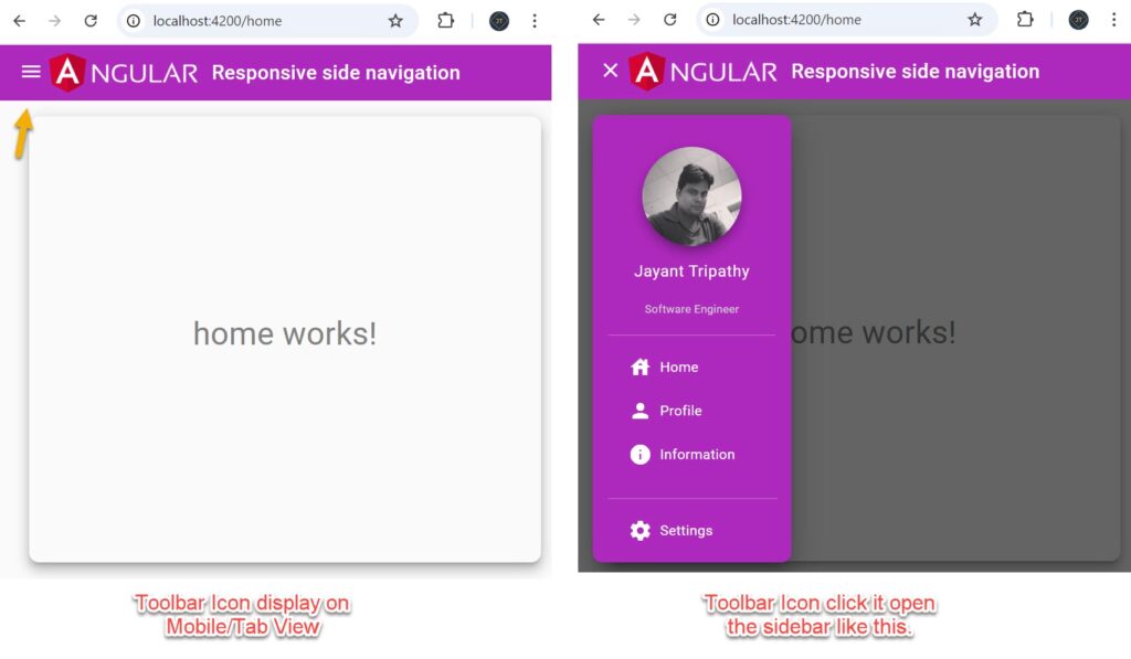
That’s it for the change. This appears much more natural and may very well be used in a real app.
Source Code
</> Please find the source code on this link.
Conclusion
This article discussed How to Create a responsive sidebar with Angular Material- Angular 18 Example Series. Sidebar navigation menus are the most frequent layout type web apps used today, here we discussed fully responsive angular material sidebar.
Leave behind your valuable queries and suggestions in the comment section below. Also, if you think this article helps you, do not forget to share this with your developer community. Happy Coding 🙂
Related Articles
- Deploying Angular apps in Azure Blob Storage with CI/CD Integration 🚀
- Building a Chatbot in Angular using Gemini API
- Create a responsive sidebar with Angular Material- Angular 18 Example Series
- How to Deploy Angular 17/18 App in GitHub Pages
- How to convert Text To Speech With Azure Cognitive Services using Angular and .Net Core
- Angular Interceptors- The Complete Guide
- Upload Download and Delete files in Azure Blob Storage using ASP.NET Core and Angular
- How to use Policy-based Authorization using JWT in .Net Core 7 and Angular
- How to deploy Angular App in Azure Static Web App
- Global Error Handling in Angular
- How to host Angular app on AWS S3 bucket using CloudFront
- How to Deploy Angular App in GitHub Pages
- How to use Signature Pad Component in Angular
- How to use Drag and Drop items in Angular
- Ionic Framework Tutorial: Build your first Ionic cross-platform mobile app
SUPPORT ME
